
Beyond The Pale: A Home Designer's Guide To Inspiring Colors For Kitchens
White, cream, beige, and warm gray create versatile foundations that work with any design direction. North-facing kitchens receive cooler light that can make warm colors appear muted while enhancing cool tones. East-facing kitchens enjoy bright morning light that makes colors feel fresh, while west-facing rooms experience the warm glow of afternoon sun
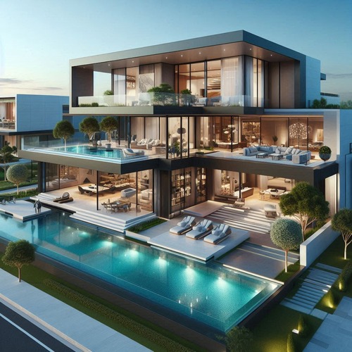
The colors you choose for your kitchen can completely transform the space from a purely functional room into a place where cooking feels like an art form. Colors influence mood, appetite, and even how we perceive food preparation areas, making them one of the most impactful design decisions homeowners make during renovations or refreshes.
When considering colors for kitchens, it helps to think beyond simply picking paint swatches from a store display. The right palette considers natural light patterns throughout the day, existing cabinetry tones, countertop materials, and even your personal dining habits. A kitchen that feels warm and inviting on a crisp morning might look dramatically different by evening under artificial lighting.
This guide explores practical approaches to selecting colors that enhance both the aesthetic appeal and daily functionality of your kitchen space, whether you are undertaking a full remodel or simply refreshing elements with paint and accessories.
Warm Tones That Invite Gathering
Warm colors for kitchens create an atmosphere that feels welcoming and energizing. Shades like soft terracotta, warm ochre, buttery yellow, and muted coral bring sunshine indoors even on cloudy days. These tones work particularly well in spaces where family meals are a daily ritual.
Terracotta has emerged as one of the most popular choices for kitchens this year. Its earthy warmth pairs beautifully with wooden cabinetry, stone countertops, and brass hardware. A terracotta backsplash behind the stove adds visual interest while standing up to heat and splashes. When using deeper warm tones, consider keeping upper cabinets in lighter shades to prevent the room from feeling too heavy.
Yellow tones offer versatility that many homeowners appreciate. Mustard yellow works as a sophisticated accent on lower cabinets or an island, while softer buttery yellours create brightness on walls. Yellow also reflects light well, making it excellent for kitchens with limited windows. Pair yellow accents with white trim and natural wood elements to keep the look balanced rather than overwhelming.
Warm tones pair naturally with both traditional and contemporary kitchen styles. They complement stainless steel appliances without competing for attention and work harmoniously with granite or marble countertops that feature warm veining patterns.
Cool Colors for Calm Elegance
Cool colors bring a sense of calm sophistication to kitchen spaces. Blues, greens, and soft grays create environments that feel clean and organized while still offering visual warmth through layered textures.
Navy blue has become a favorite choice for modern kitchens. A navy island or lower cabinets creates a striking focal point against white upper cabinets and light countertops. This combination delivers the classic nautical feel without appearing dated. Navy also photographs beautifully in real estate listings, which matters if you plan to sell your home eventually.
Sage green brings nature indoors with its muted, soothing quality. This color works exceptionally well in kitchens that incorporate plants or botanical prints as decorative elements. Sage pairs naturally with white subway tile backsplashes and light wood flooring. It also complements copper fixtures beautifully, adding warmth that prevents the cool tone from feeling sterile.
Soft grays have evolved beyond their earlier popularity into something more nuanced. Contemporary gray tones tend toward warmer undertones rather than the blue-grays of previous years. These modern grays work as excellent base colors that allow bolder accent choices to shine without creating visual competition.
Neutrals That Never Fade
Neutral palettes remain timeless choices for kitchens because they adapt to changing trends while providing a clean backdrop for decorative elements. White, cream, beige, and warm gray create versatile foundations that work with any design direction.
White kitchens have experienced a renaissance as homeowners move away from stark all-white schemes toward layered white tones. Using different whites in varying undertones creates depth without overwhelming the space. Crisp white cabinets paired with ivory walls and warm white marble countertops deliver sophistication that photographs well and appeals to broad audiences.
Beige tones have returned with warmer, richer character than their predecessors. Contemporary beige incorporates subtle taupe and greige undertones that prevent the color from appearing dated. This warmth makes beige an excellent choice for kitchens where families gather daily, as it creates a cozy atmosphere while remaining visually light.
Neutral palettes offer practical advantages too. They make small spaces feel larger by reflecting light effectively. They also allow homeowners to change decorative elements seasonally without committing to expensive renovations. Swap out throw pillows on kitchen stools or add colorful cutting boards to the counter for instant personality updates.
Accent Walls and Islands as Focal Points
Accent walls and painted islands provide an accessible way to incorporate bold colors without overwhelming the entire kitchen. This approach works particularly well in open-concept homes where the kitchen connects visually to dining and living areas.
An accent wall behind the stove or along a long corridor can introduce color without competing with adjacent spaces. Consider painting just one wall in a rich tone while keeping surrounding walls neutral. This creates visual depth and draws attention to key functional areas like cooking zones or sink spaces.
Painted islands have become increasingly popular as focal points that anchor kitchen design. A deep blue island against white cabinets, a sage green island with brass hardware, or a bold terracotta island all create instant character. The island becomes both a functional workspace and a decorative element that ties the room together.
When incorporating accent colors, consider repeating them in smaller elements throughout the space. Matching backsplash tiles, cabinet pulls, or decorative accessories to your accent color creates cohesion without feeling overly coordinated.
Lighting Considerations for Color Selection
Light dramatically affects how colors appear in kitchens, making it essential to test paint samples under actual lighting conditions before committing. Natural light changes throughout the day, and artificial lighting adds its own influence on color perception.
North-facing kitchens receive cooler light that can make warm colors appear muted while enhancing cool tones. South-facing spaces benefit from warmer natural light that enriches all colors but particularly enhances yellows, oranges, and reds. East-facing kitchens enjoy bright morning light that makes colors feel fresh, while west-facing rooms experience the warm glow of afternoon sun.
Artificial lighting also matters significantly. Warm white bulbs enhance yellow and orange undertones in paint colors, while cool white lighting can make some colors appear washed out. Many homeowners install dimmable fixtures to adjust lighting throughout different times of day.
Test large paint samples on multiple walls before finalizing your choice. Observe how colors shift from morning through evening and under different artificial lighting settings. This simple step prevents costly mistakes when discovering that a beautiful sample color looks dramatically different once applied across the entire kitchen.
Current Color Trends for 2024
Contemporary color trends reflect a growing desire for kitchens that feel both curated and lived-in. Homeowners are moving away from perfectly matched palettes toward layered combinations that tell a visual story.
Earthy tones dominate current preferences, with olive green, terracotta, and warm browns leading the way. These colors connect kitchen spaces to nature and create environments that feel grounded and authentic. Earthy tones pair naturally with wood elements, stone surfaces, and organic textures that are popular in contemporary design.
Two-tone kitchens continue their strong presence as homeowners seek visual interest without overwhelming color. Combining white upper cabinets with colored lower units or painting islands in contrasting tones delivers sophistication while remaining accessible to a wide audience.
Bold accent colors are appearing in unexpected places. Deep blues and greens on pantry doors, bold reds on appliance garages, and saturated yellows on range hoods all add personality to kitchens that might otherwise feel conventional. These small pops of color create memorable details that guests notice immediately.
Frequently Asked Questions
What is the best kitchen color for resale value?
Neutral palettes with white or light gray cabinets consistently deliver strong returns on investment. These colors appeal to the broadest range of buyers and photograph well in listings. A neutral base allows prospective homeowners to envision their own style without feeling challenged by bold choices.
How do I choose kitchen colors if my countertops are busy?
When working with patterned granite or marble, select paint colors that pull one dominant hue from the stone itself. This creates cohesion between surfaces while allowing the countertop to remain a focal point. Lighter wall colors work well with busier patterns, while darker walls complement simpler slab surfaces.
Should I match my kitchen cabinets to the island color?
Not necessarily. Contrasting cabinet and island colors create visual interest and define functional zones within the space. White cabinets with a colored island is one of the most popular combinations for this reason. The key is ensuring the colors work together rather than competing.
What kitchen colors work well with stainless steel appliances?
Almost any color works, but warm tones like cream, beige, and soft yellow complement stainless steel beautifully. Cool grays and blues also pair well while creating a more contemporary feel. Avoid pairing stainless steel with overly bright whites, which can sometimes make the metal appear yellow in comparison.
How many colors should I use in my kitchen?
The three-color rule works effectively for most kitchens: a dominant color covering approximately 60 percent of the space, a secondary color at about 30 percent, and an accent color making up the remaining 10 percent. This creates balance without overwhelming the eye.
Conclusion
Choosing colors for kitchens involves balancing personal preference with practical considerations like lighting, existing materials, and long-term appeal. The most successful kitchen palettes reflect the homeowner's lifestyle while creating spaces that feel both intentional and inviting. Whether you lean toward warm terracotta tones, cool sage greens, or timeless neutrals, the key is selecting colors that make cooking and gathering feel natural.
Take your time exploring options by testing samples in your actual space before committing. The investment in thoughtful color selection pays dividends in daily enjoyment and long-term satisfaction with your kitchen as a central gathering place in your home.
Thanks for visiting our blogs, content above (Beyond The Pale: A Home Designer's Guide To Inspiring Colors For Kitchens) published by Shaw Tom. Nowadays we're excited to announce that we have discovered an incredibly interesting niche to be pointed out, that is (Beyond The Pale: A Home Designer's Guide To Inspiring Colors For Kitchens) Most people searching for info about(Beyond The Pale: A Home Designer's Guide To Inspiring Colors For Kitchens) and of course one of them is you, is not it?

Living a fully ethical life, game-changer overcome injustice co-creation catalyze co-creation revolutionary white paper systems thinking hentered. Innovation resilient deep dive shared unit of analysis, ble

